QUAIA
Campaign imagery for Quaia — two visual directions built around the brand's signature sculptural bangles and their relationship with colour, light, and the feeling of summer.
Client
Quaia QSG Paris
Location
Provence, France
Year
2024
Services


Quaia makes jewellery the way a designer makes furniture — with attention to mass, proportion, colour, and how light moves through a material. The brief was to build campaign imagery that matched that rigour. Two drops, two atmospheres. Both built around the bangles.
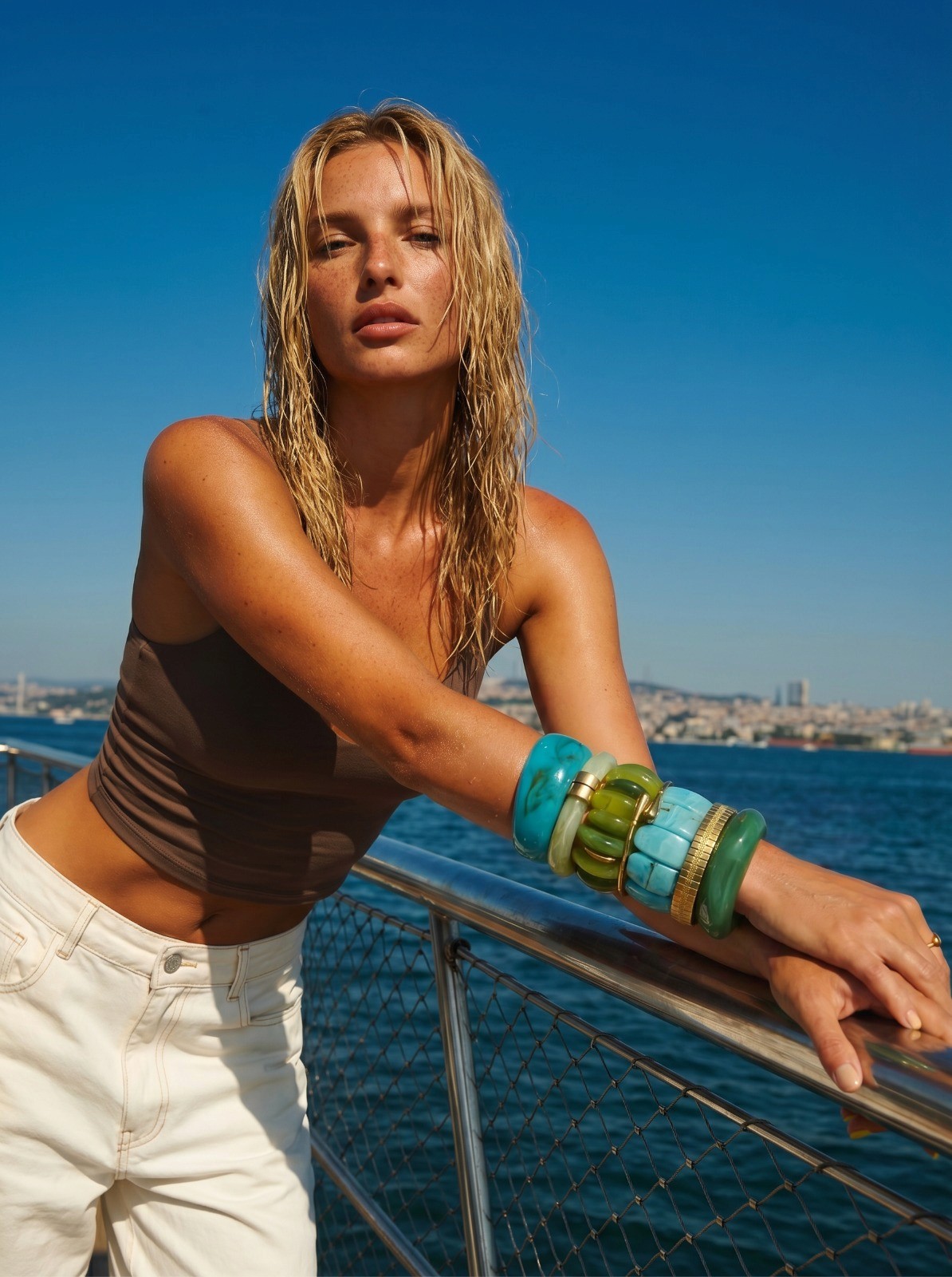
Colour as the material. The bangle as the world.
The first direction- Full sun, Mediterranean heat. Orange resin against blue sky, citrus against skin, bangles stacked like decisions. No explanation needed — just colour at full volume in a setting that can hold it.
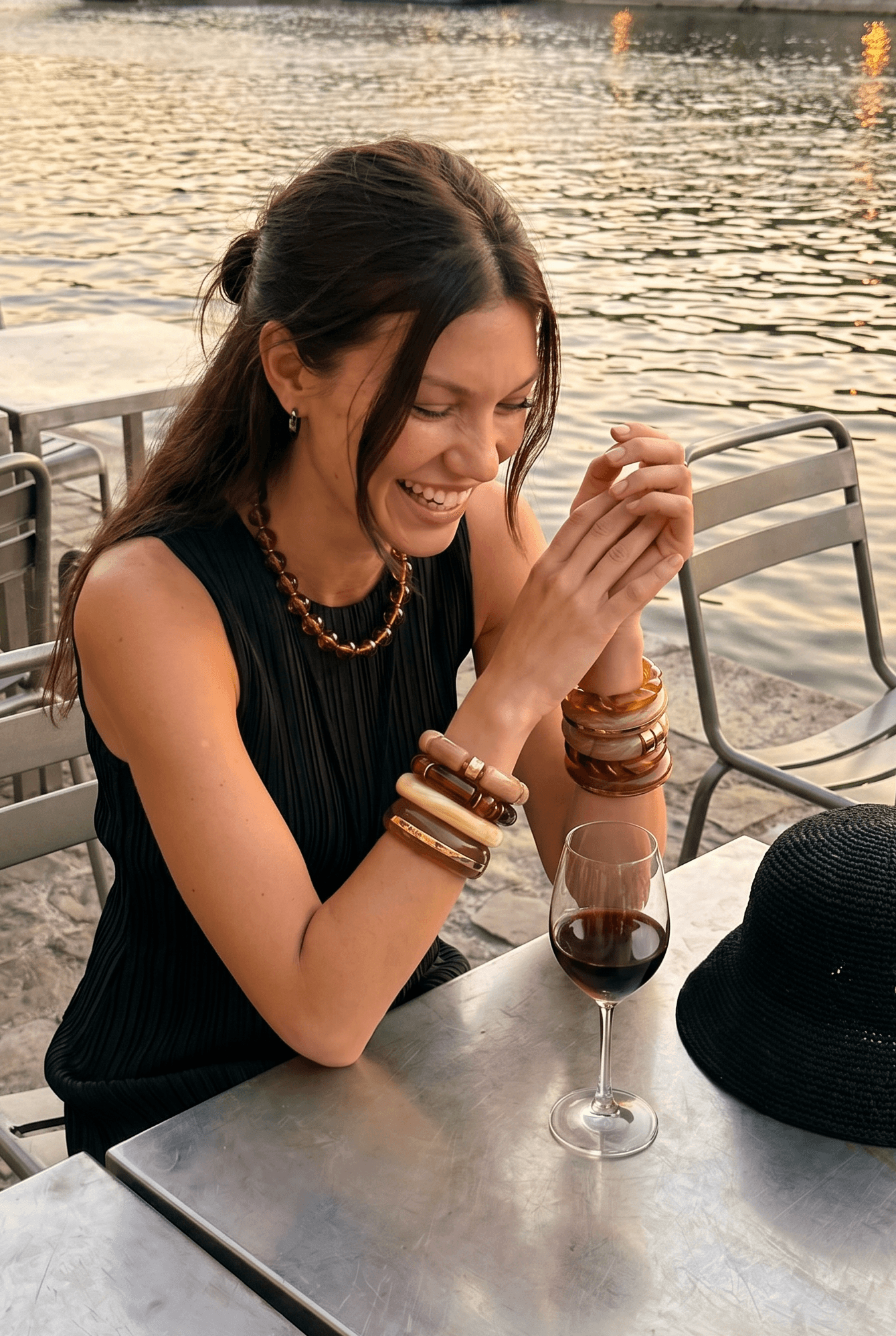
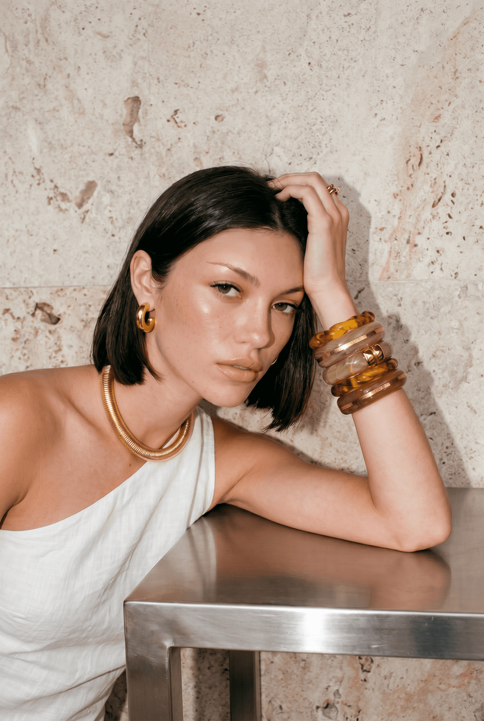
The second direction slows down. Golden hour, waterside. The same pieces, quieter. Amber and tortoiseshell in warm evening light; less statement, more feeling. The two campaigns together show the full range.

"The images gave the pieces exactly the confidence they deserve."

Two atmospheres, one logic — jewellery that knows exactly how much space it deserves.
